CitiBanamex:
Redesigning core banking journeys, scaling design systems, and driving product discovery

During my time at Globant, I worked on CitiBanamex’s digital banking platform at a moment of transformation. The work spanned three parallel initiatives critical to the product’s evolution: < - ⊛ The redesign of BancaNet, CitiBanamex’s core digital banking platform
- ⊛ The definition and delivery of a shared design system across teams
- ⊛ The ideation of personalized product discovery components to increase awareness and adoption of CitiBanamex’s portfolio
Each initiative addressed different layers of the product while sharing the same goal: improving clarity, trust, scalability, and user engagement in a regulated financial environment.
Role
Product Designer
(UX Strategy, Interaction Design,
Design Systems)
Deliverables
Product strategy
UX strategy
UI Design
Team
Globant / Citibanamex
Year
2020
I was responsible for defining UX strategy and interaction patterns across these three streams. I worked independently on design decisions while aligning with product, engineering, and other designers to ensure consistency and scalability.

The problem I focused on:
Users struggled to understand their financial context, which limited trust and reduced engagement with additional banking products. Product acquisition flows were long, fragmented, and disconnected from user intent.
Key decisions I made
🔹 I decided to simplify the information architecture before refining the UI, as usability issues were structural rather than visual.
🔹 I prioritized contextual product discovery over static promotions, integrating personalized suggestions directly into account and card views.
🔹 I chose progressive disclosure and data reuse to reduce friction in product acquisition flows and increase completion rates.
🔹 I emphasized trust and clarity over visual novelty, using clear system feedback, error prevention, and accessibility-first patterns.

Workstream 1: BancaNet Redesign (Core Experience)
Challenge
BancaNet’s core journeys had grown fragmented over time, increasing cognitive load and reducing users’ ability to understand their financial context and complete tasks efficiently.
Key Decisions
- • I restructured the information architecture to simplify navigation and clarify hierarchy.
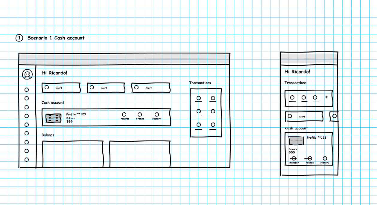
- • I redesigned core flows (account overview, transactions, product entry points) to reduce friction and errors.
- • I prioritized clarity and accessibility to reinforce trust in daily banking interactions.
Impact
- • Improved usability across core banking tasks
- • Reduced friction in high-frequency flows
- • Established clearer foundations for future feature growth
Workstream 2: Design System Delivery (BlueBox)
Challenge
Multiple teams were designing in parallel without shared standards, resulting in inconsistencies and duplicated effort.
Key Decisions
- • I collaborated with other designers to define and document reusable components, interaction patterns, and guidelines.
- • I ensured components could scale across products while respecting regulatory and accessibility constraints.
- • I supported adoption by aligning design decisions with development workflows.
Impact
- • Increased consistency across CitiBanamex digital products
- • Faster design and development cycles
- • Stronger alignment between design and engineering teams
Workstream 3: Personalized Product Discovery Components
Challenge
Users were unaware of the breadth of CitiBanamex’s product offering, and existing cross-sell mechanisms were generic and poorly timed.
Key Decisions
- • I ideated and designed personalized product discovery modules embedded within relevant user journeys (accounts, cards, savings).
- • I prioritized contextual relevance over static promotion, aligning product suggestions with user behavior and financial needs.
- • I designed the components to be modular and reusable across different sections of BancaNet.
Impact
- • Increased engagement with product discovery features
- • Better visibility of CitiBanamex’s product ecosystem
- • Scalable patterns that supported future growth initiatives
Research & Insights
User Personas
I synthesized existing research, personas, and behavioral insights to understand users’ motivations around financial control, product acquisition, and trust. This informed a set of job stories focused on reducing effort, increasing clarity, and surfacing relevant products at moments of intent.
Context
"When I use BancaNet,
I wish to know more about my account to consolidate all my credit information
in one place."
Desire
"When I need to acquire another product
I want an easy procedure
to save time."
Outcome
"When I check my debit card,
I want to see products that match my profile
to find what I need."
Problem Definition
Identify User Goals

1. Easily acquire additional products.
Design Requirement:
• Streamline product acquisition with short user paths and data reuse.
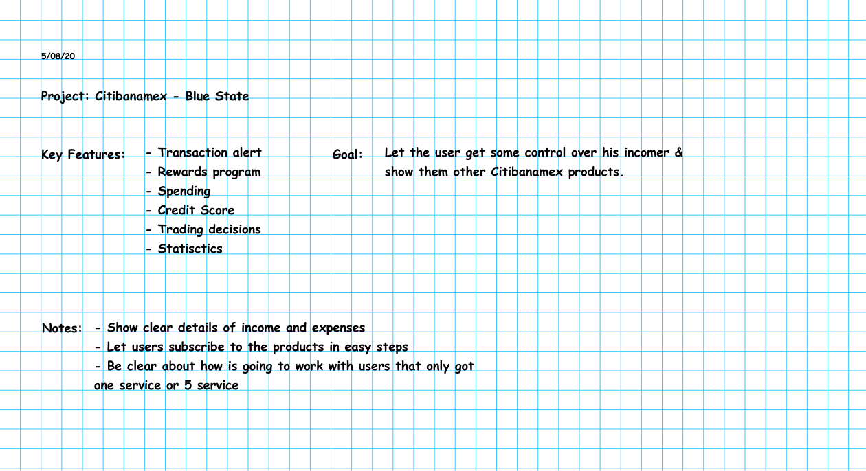
2. Maintain control over income and expenses.
Design Requirement:
• Provide detailed spending information and control over recurring payments.
3. Understand the benefits of using other bank products.
Design Requirement:
• Showcase other products attractively to encourage engagement.
Ideation and Design Process
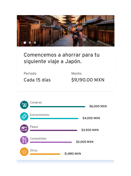
Blue State: suggestion modules, designed to help to acquire new products tailored to user needs.
Objective: Develop a user-friendly savings module that simplifies product acquisition and provides better financial management tools.
• Competitive Analysis: Researched competitors to identify best practices.
• User Discussions: Engaged with users to uncover pain points and desirable features.
• User Flow Development: Designed user flows to ensure intuitive navigation.
• High-Fidelity Mockups: Created detailed mockups to visualize the solution.

Solution.
I designed a set of modular interaction patterns (“Blue State” suggestion modules) that enabled personalized product recommendations and simplified savings and acquisition flows. These modules were designed to be reusable across journeys, supporting both user growth and long-term scalability.


Impact
Improved engagement and clarity across BancaNet core journeys
Reusable design system components adopted by multiple teams
Personalized product discovery patterns that supported cross-sell and user growth
Stronger user trust through accessible, consistent, and transparent design
Closign Reflection
Working across core experience redesign, system-level foundations, and growth-oriented components reinforced the importance of designing at multiple layers simultaneously.
This project demonstrates how product design can drive usability, scalability, and business impact when decisions are made holistically rather than feature by feature.